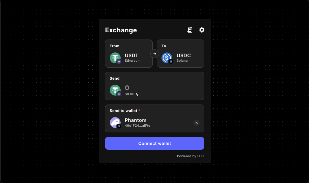
LI.FI Widget Docs for React, Next.js, and Cross-Chain Swap UX
Use these LI.FI widget docs to install an embedded swap or bridge flow, configure wallet and route behavior for React or Next.js, and launch a production-ready cross-chain experience with fewer onboarding surprises.
What LI.FI widget teams usually need first
- Install
@lifi/widgetand confirm the first client-rendered LI.FI widget embed loads cleanly. - Decide whether wallet connection belongs before the widget opens or inside the swap flow.
- Limit chains, tokens, and route scope before you add branding, fees, or wider growth UX.
- Pair implementation work with the error-handling guide when the host product needs clearer recovery states.
The existing LiFi Widget component page introduces the component. This docs page is for builders who need practical LI.FI widget docs for React or Next.js, including wallet timing, route controls, and production-minded swap or bridge setup.
Use this guide when you need quick answers to practical integration questions: should the app connect wallets before the widget opens, which chains or routes should stay available, and what supporting context should users see before the first swap or bridge action.
If you are still comparing layouts or config tradeoffs, review the LI.FI playground guide first. If your main blocker is onboarding flow design, pair this page with the LI.FI wallet connect guide before moving into the tighter integration sequence.
If the integration already works but your open question is how to explain wallet issues, route failures, or stalled transaction states, continue with the LI.FI Widget Error Handling Guide.
When the open question is how embedded wallets should change route scope, destination expectations, or connection timing, continue with the LI.FI Widget Embedded Wallet Routing Guide.
If the route already works and the missing layer is pre-transaction clarity, continue with the LI.FI Widget Route Preview Guideto frame destination expectations, estimated outcomes, and next-step context before users submit.
What the LiFi Widget is good for
The Gizmolab wrapper around @lifi/widget gives you a reusable React component for cross-chain swaps and bridging. It is useful when your product needs asset movement inside the app instead of sending users to a separate destination.
- onboarding flows that require asset movement before users can continue
- wallets and dashboards that need a built-in swap or bridge action
- DeFi interfaces that want a cleaner cross-chain entry point
- consumer apps that need a faster path to embedded transfer UX
Quickstart: install, mount, then narrow routes
1. Install the package
2. Mount the widget
Start with a minimal client-rendered page. Confirm the widget loads in the exact container where users will interact with it before you add chain restrictions, fee logic, or custom theming.
Recommended integration flow
The safest order is install first, render the widget in a stable page or panel, and only then narrow the experience with chain, token, fee, or theme rules.
- prove the integration works in your real layout
- decide whether the widget is a destination or a step in a larger flow
- restrict chains or tokens only when product rules require it
- add fees and branded styling after the base user path is stable
That separation matters because integration bugs and UX decisions are two different jobs. Treat them separately and your rollout gets easier to test.
Core props worth using
integrator
Identify the application or company name tied to the widget integration.
variant / subvariant
Choose whether the widget should feel compact, wide, or drawer-based depending on the page surface.
appearance
Keep the widget aligned with the surrounding UI using the supported light or dark appearance modes.
allowedChains / allowedTokens
Narrow the experience when your product only supports a limited route or asset set.
fee / feeConfig
Add monetization only when disclosure and support expectations are clear.
theme
Apply brand styling so the widget feels native instead of bolted on.
transactionSettings
Control transaction behavior when you need tighter product-level defaults.
walletManagement
Tune wallet behavior when your integration needs a more opinionated connection experience.
Example: branded integration with tighter chain control
Use a wider layout when swap or bridge activity is the primary job of the screen. This works well for a dedicated trading or treasury surface.
Example: centralize widget configuration
Reach for a shared WidgetConfig object when multiple routes should inherit the same widget behavior.
Implementation decisions worth making early
Decide whether the widget is a destination or a step
A dedicated swap page needs a broader layout and more surrounding context. An embedded action inside onboarding or deposits usually needs fewer controls and a tighter scope.
Decide how much choice users should have
A broad cross-chain experience can be powerful, but it can also create unnecessary branching. If your product only supports a narrow route, configure the widget narrowly.
Decide whether fees belong in version one
The component supports monetization, but many teams are better served by validating route quality and support burden before adding fee logic.
Production checklist
- Install
@lifi/widget. - Mount the Gizmolab
LiFiWidgetcomponent in a client-rendered surface. - Pass an
integratorvalue. - Choose a layout with
variant,subvariant, andappearance. - Restrict chains or tokens only when the product requires it.
- Validate the widget in the real page container, especially inside tabs, drawers, or modals.
- Review fee presentation before enabling
feeorfeeConfig.
Related docs and components
FAQ
Do I need to build swap and bridge logic from scratch?
No. The point of the LiFi Widget is to give you a ready-made UI surface for cross-chain swaps and bridging, which you can then adapt with configuration and product-level UX decisions.
Can I brand the widget to match my app?
Yes. The Gizmolab wrapper exposes theming controls for container styling, colors, and typography alongside layout and appearance props.
Can I limit which chains or tokens users see?
Yes. Use allowedChains and allowedTokens when you need a narrower or policy-driven experience.
Should I use individual props or a WidgetConfig object?
Use individual props when you want clarity in a single-page implementation. Use a shared WidgetConfig object when you want centralized control or shared defaults across several routes.
Add the LiFi Widget with less integration overhead
Start with a minimal embed, confirm the widget works inside the real layout, and then layer in branding, chain restrictions, token restrictions, or fee logic only where the product actually needs them.