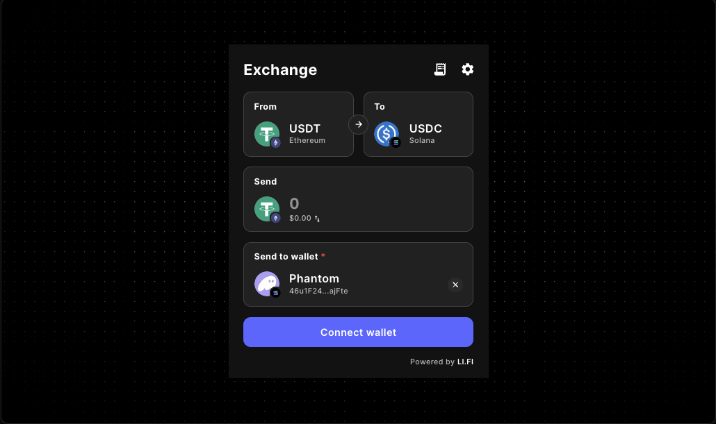
LI.FI Playground Guide for Checkout Routing Workflows
Evaluate the LI.FI Widget before you commit it to a production checkout, swap, or embedded-wallet flow. Review layout, scope controls, routing constraints, and wallet behavior in a cleaner developer workflow before deeper integration work begins.
The quickest way to assess a cross-chain widget is not by reading a prop list in isolation. It is by seeing how the component behaves with realistic checkout layouts, chain restrictions, token restrictions, theming, and wallet settings.
A LI.FI playground gives you that evaluation layer before deeper integration work begins, which makes it easier to decide what belongs in a destination page, what should stay in a narrower checkout or onboarding flow, and which controls matter enough to keep.
Why start with a LiFi playground
Cross-chain widget evaluation usually starts with a short list of practical questions. A playground gives you room to answer them without overcommitting to a final checkout layout or routing policy too early.
- Does the widget fit the checkout or deposit-confirmation surface where users actually need it?
- How much control do you have over chains, tokens, routing states, and wallet prompts?
- Can you brand the flow without turning the integration into a redesign project?
- What happens when you need a narrower product-safe checkout experience instead of a fully open routing surface?
- How should you test swap, bridge, and embedded wallet behavior before wiring the widget into a real product flow?
What to evaluate first
Layout and screen fit
Start by checking whether the widget works as a primary destination or as a supporting panel inside a larger UI. The first layout controls worth testing are variant, subvariant, and appearance.
Scope control
Many teams do not want a fully open interface. They want a widget that reflects product policy, asset scope, or approved user routes, which is where allowedChains, allowedTokens, and transactionSettings become useful.
Branding and visual consistency
Review theme, appearance, spacing, and readability in a real page layout so the widget feels native next to the rest of the app.
Fee and monetization logic
Evaluate fee and feeConfig separately from the first embed so the base user flow stays easier to debug and review.
Wallet behavior
Check walletManagement only after the baseline widget is stable, and verify any production guidance about wallet patterns before publishing it.
Quick start for a local evaluation flow
1. Install the widget package
2. Render the widget in an isolated test page
Start with the smallest possible embed. Before changing multiple settings at once, confirm the widget renders correctly in the same environment, container, and page structure you expect to use later.
3. Add one layer of configuration at a time
- base render with integrator
- layout changes with variant, subvariant, and appearance
- scope limits with allowedChains and allowedTokens
- visual customization with theme
- fee logic and wallet behavior only after the base flow is understood
Recommended playground configuration areas
Minimal baseline
Use the smallest possible setup to answer one question: does the widget load and behave correctly in your app shell? Start with an integrator value so you have a clear reference point before narrowing behavior.
Scope controls
If your app supports only a defined set of chains or assets, the playground should mirror that early rather than waiting until the end of integration.
allowedChainsallowedTokenstransactionSettings
Theme alignment
Use theme to review container styling, colors, border treatment, typography alignment, and contrast next to the rest of the page.
Shared config objects
If your team prefers centralized configuration, test that approach directly with a shared WidgetConfigobject.
Example: evaluate a narrower branded setup
A wider playground setup helps you test how the widget feels when it is closer to a dedicated cross-chain page rather than a compact utility.
This type of setup helps answer practical questions quickly:
- Does the wider layout feel right for a dedicated cross-chain page?
- Do restricted chains make the flow clearer?
- Does the theme feel native next to the rest of the interface?
- Is fee presentation something you want in the first release or later?
A practical evaluation workflow
- Start with an isolated route so layout issues are easy to spot.
- Confirm the baseline interaction and check for clipping, spacing, or layering problems.
- Run at least one checkout-style flow so you can verify how the routing surface behaves under real product constraints.
- Apply allowedChains and allowedTokens only after the unrestricted version is understood.
- Compare compact and wide layouts to decide how explicit the widget surface should be.
- Review styling in context with your real navigation, background, and supporting UI.
- Decide whether the widget is a destination or a step inside a larger checkout or onboarding flow.
- Validate production-sensitive settings like fees and wallet behavior last.
Where this guide fits in the docs flow
Use this page when you are still evaluating behavior and configuration choices. Move deeper into the docs flow when you need to review the component reference, compare another embedded trading-style surface, or start a project setup path.
Common mistakes during widget evaluation
Testing too many variables at once
When layout, chain restrictions, theme changes, and fee logic all change together, it becomes much harder to understand what actually caused the result you are seeing.
Evaluating the widget outside the real UI context
A widget that looks correct in an empty test shell may behave differently inside the production container, especially when tabs, panels, drawers, or page-level spacing are involved.
Keeping the configuration too broad
If your product supports a narrower set of routes or assets, evaluate the widget with those constraints early. A broad default test can hide usability issues that appear only in the scoped version.
Treating the playground as production documentation
The playground is for evaluation. Production-facing claims about supported chains, tokens, wallet patterns, or routing assumptions should only be published after verification.
FAQ
What is a LiFi playground?
A LiFi playground is a test surface for evaluating how the LiFi Widget behaves before you wire it into a production flow. It helps developers review layout, configuration, UI behavior, and scope restrictions in a more practical way than a prop list alone.
Is the playground different from the component reference?
Yes. The component reference explains what the widget exposes. The playground workflow is about testing how those options behave in a realistic UI setup.
What should I configure first?
Start with integrator, then test layout controls, then scope restrictions, then theming. Add fee and wallet-management decisions after the baseline interaction is working.
Should I use individual props or a WidgetConfig object?
Use individual props when you want to inspect and compare settings quickly in a single test page. Use a shared WidgetConfig when you want centralized behavior across multiple surfaces.
Can I limit the widget to selected chains or tokens?
Yes. The widget exposes allowedChains and allowedTokens for narrowing the experience. Verify any production defaults before publishing them as supported guidance.
Does this guide replace the full integration docs?
No. This guide works best as the evaluation layer before you move into component-specific implementation details and broader setup docs.
Continue from evaluation to implementation
Start with the smallest viable LiFi Widget embed, observe how it behaves in your actual layout, and then add only the controls your product really needs.